Every small business collects data—but not every business uses it effectively. The difference between guessing and making data-driven decisions often comes down to how well you track key performance indicators (KPIs) and visualize your data.
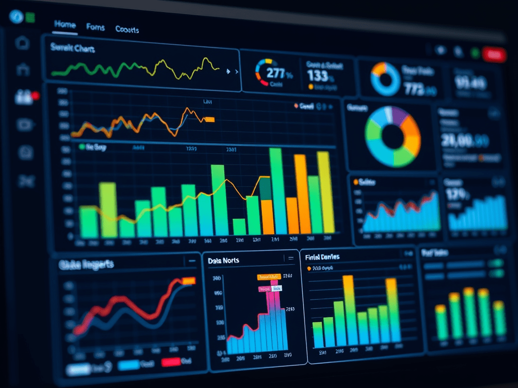
A spreadsheet full of numbers is overwhelming, but a well-designed dashboard can help you see insights in seconds. Understanding the right data visualization types and KPIs for your business is the key to improving efficiency, profitability, and decision-making.
📊 Why Data Visualization Matters for Small Businesses
Data visualization transforms raw numbers into clear, actionable insights. Instead of spending hours reviewing reports, a quick glance at a well-designed chart can show you:
✅ Which products or services generate the most revenue
✅ How customer trends are shifting over time
✅ Where operational inefficiencies are costing money
✅ Which marketing efforts are driving actual results
Small businesses don’t need complex enterprise tools to gain these insights. Platforms like Power BI, Google Sheets, Excel, and Looker allow you to create dynamic, custom dashboards that track the most important business metrics.
📈 The Best Data Visualizations for Small Businesses
Different types of data require different types of visualizations. Here are the most effective charts and graphs to use in a small business dashboard:
1. Line Charts: Tracking Performance Over Time
Best for: Sales, revenue trends, customer growth, and expense tracking
📌 Why it’s useful: A simple line chart can instantly show if your revenue is increasing, sales are slowing, or costs are creeping up. Instead of reviewing months of financial statements, a quick glance at a trend line makes patterns obvious.
2. Bar Charts: Comparing Categories & Trends
Best for: Product sales, department performance, marketing campaign results
📌 Why it’s useful: A bar chart makes it easy to compare which products, services, or marketing strategies are driving the most business. It’s a go-to for breaking down revenue streams or customer demographics.
3. Pie Charts: Understanding Proportions
Best for: Expense breakdowns, revenue sources, customer demographics
📌 Why it’s useful: A pie chart helps businesses visualize proportions at a glance—how much of your revenue comes from different sources, how your budget is allocated, or where customers are coming from.
4. Funnel Charts: Tracking Customer Conversions
Best for: Sales pipelines, lead-to-customer conversion rates, marketing funnel analysis
📌 Why it’s useful: A funnel chart shows where customers drop off in your sales process. If many leads come in but few convert to sales, it may indicate a pricing issue, weak follow-up, or ineffective marketing.
5. Heat Maps: Identifying Patterns & Anomalies
Best for: Customer engagement, website traffic, operational efficiency
📌 Why it’s useful: A heat map helps businesses see where activity is concentrated. For example, an e-commerce site can track where customers spend the most time, while a restaurant can analyze peak hours for staffing.
🎯 The Most Important KPIs for Small Businesses
Tracking the right KPIs (Key Performance Indicators) ensures your business stays profitable and efficient. Here are the essential metrics every small business should track and visualize:
1. Revenue & Profitability Metrics
✅ Monthly Recurring Revenue (MRR): Predictable revenue from repeat customers
✅ Customer Acquisition Cost (CAC): The cost of getting a new customer
✅ Customer Lifetime Value (CLV): Total revenue a customer brings over their lifetime
✅ Net Profit Margin: How much of your revenue is actual profit
📌 Why it matters: Without tracking revenue trends and profitability, businesses lose sight of growth opportunities and risk running into cash flow issues.
2. Customer & Sales Performance Metrics
✅ Customer Retention Rate: The percentage of customers who return
✅ Sales Conversion Rate: The percentage of leads that turn into customers
✅ Average Order Value (AOV): The average amount spent per transaction
✅ Churn Rate: The percentage of customers lost over time
📌 Why it matters: Acquiring new customers is expensive—tracking these KPIs helps boost retention, optimize pricing, and improve sales strategies.
3. Operational Efficiency & Productivity Metrics
✅ Lead Response Time: How fast your team follows up with new leads
✅ Inventory Turnover: How quickly products sell and are restocked
✅ Employee Productivity: Revenue generated per employee
✅ Time Spent on Manual Reporting: How much time could be saved with automation
📌 Why it matters: Small businesses often waste hours on inefficient processes. Tracking productivity helps optimize staffing, automate tasks, and increase profitability.
🚀 How Small Businesses Can Take Action Today
📌 Investing in data visualization and tracking KPIs can generate massive ROI.
🔹 Example: A business investing $3,000 in automated dashboards could save $15,000 annually in manual reporting time, improve conversion rates by 10%, and increase customer retention, leading to an additional $25,000 in revenue. That’s a potential ROI of over 1,300%!
💡 The best part? You don’t need expensive software. With tools like Excel, Google Sheets, and Power BI, small businesses can create custom dashboards tailored to their needs—saving time and money while gaining powerful insights.
📲 Schedule a free consultation to learn more about what Insight Empire can do for your business!


Leave a comment